Overview:
WeCare addresses the growing problem of isolation and daily support needs among elderly individuals who live alone. Many seniors struggle with loneliness and require assistance for simple tasks like grocery shopping, walking, or light household chores. Our high-level solution is a user-friendly digital platform that connects seniors with compassionate community helpers who can provide companionship and day-to-day support. Designed with safety and trust in mind, the platform includes a built-in background check process for all volunteers. The primary users of WeCare include seniors seeking support, their family members looking for reliable assistance, and approved helpers offering their time and care to enhance the quality of life for older adults.
Team & Timeframe:
WeCare was a project developed over three months by a team of three UX and product designers. Our process began with user interviews and online surveys to gather qualitative and quantitative insights into the needs of seniors and volunteers. Using this data, we aligned on a user-centered strategy and collaboratively moved through ideation, wireframing, and prototyping. I led user research, interaction design, and usability testing to ensure the final product was both functional and empathetic.

Responsibilities:
Basic narrative analysis UX Research
Concept development
Aligning stakeholders on product goals
Competitors analysis
Empathy mapping
Information Architecture UI/UX Design
User flows
Interaction design
Prototyping User testing following product strategy
Objective & Goal – Phase One
The objective of Phase One was to understand the needs, challenges, and motivations of seniors and potential volunteers. Our goal was to gather actionable insights through user interviews and surveys to inform a user-centered product strategy. This phase focused on identifying pain points related to social isolation, accessibility, and trust, which shaped the foundation for the platform’s features and overall experience design
Phase Two
We translated research insights into wireframes, user flows, and information architecture to define the structure and functionality of the platform.
Phase Three
We developed interactive prototypes and conducted usability testing to validate design decisions and refine the user experience based on real user feedback.
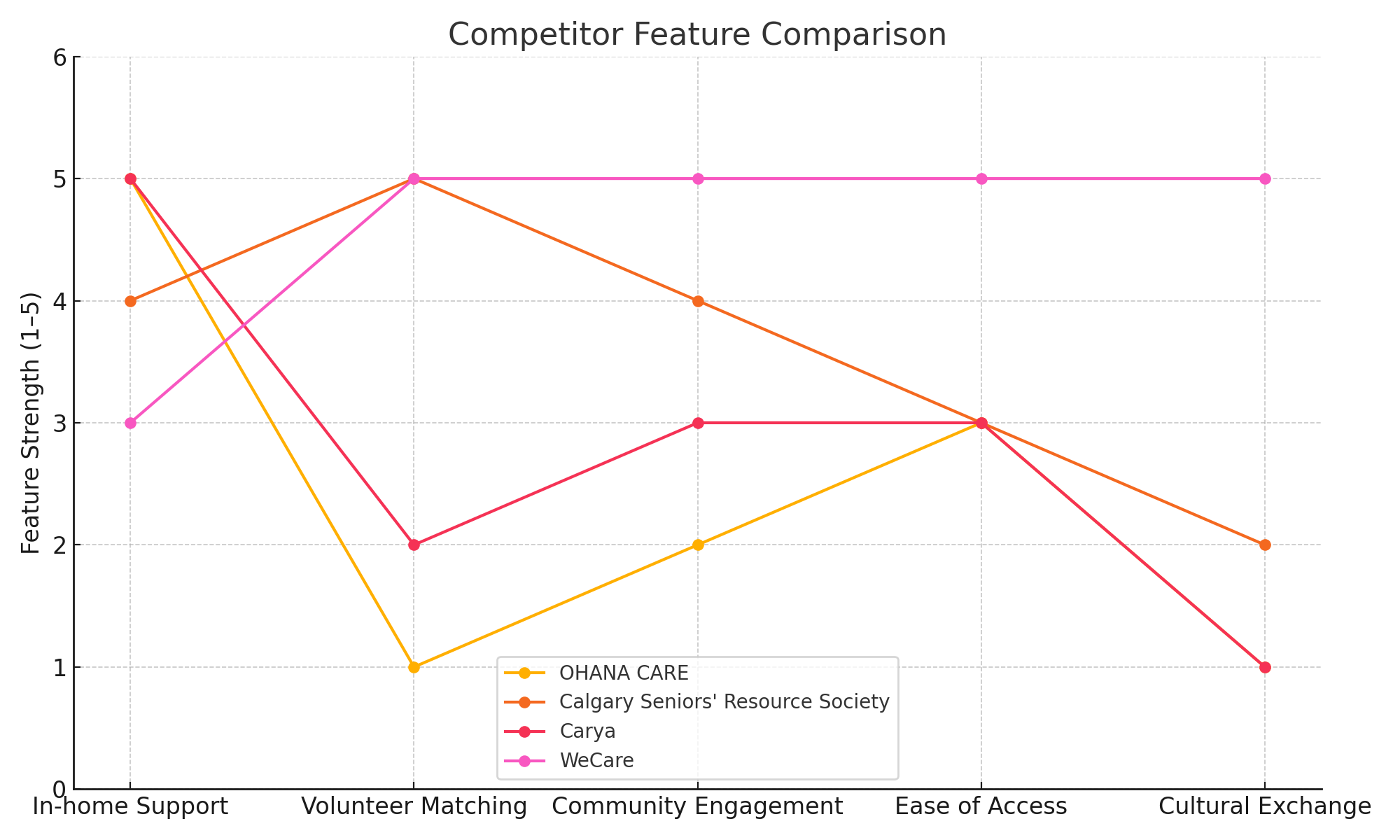
Competitor Analysis:
Who are the competitors that have similar solutions, and what is a one-line description of their solution?
OHANA CARE: They offer in-home care for seniors wanting to remain in the safety and comfort of their own.
https://love.ohanacare.ca/in-home-care
Calgary Seniors' Resource Society: They combine social work with urgent support when necessary and coordinate a network of volunteers to improve seniors' overall well-being and quality of life.
https://www.calgaryseniors.org/
Carya: Carya provides in-home support to vulnerable older Calgarians and helps them stay in their homes and retain long-time community connections.
https://caryacalgary.ca/senior-support/
Insights & Synthesizing:
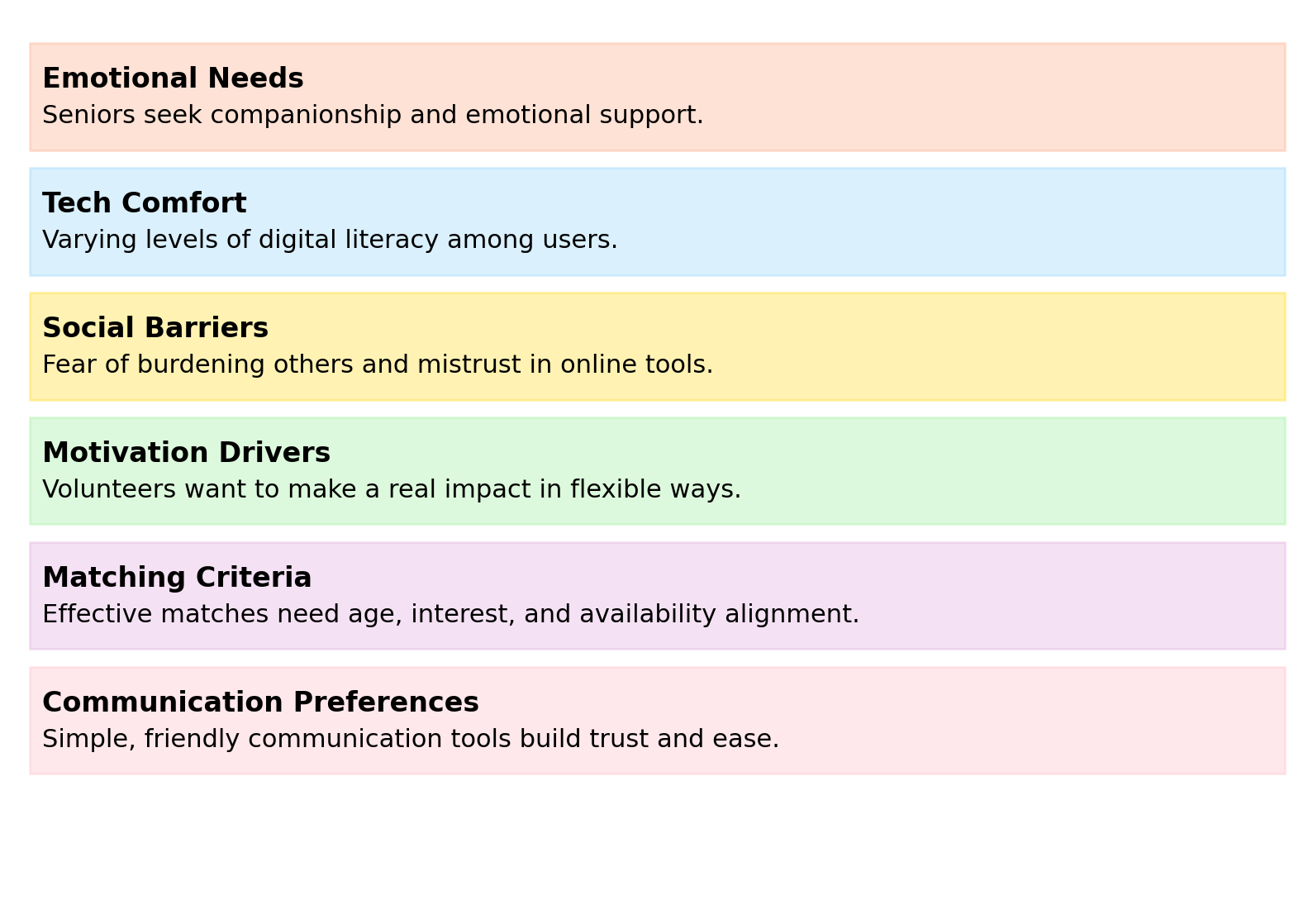
From user interviews and surveys, we discovered that seniors highly value emotional connection, ease of use, and trust in digital platforms. Many expressed hesitation around complex interfaces and privacy concerns, while volunteers sought flexible ways to contribute meaningfully. Competitor analysis confirmed a lack of personalized, intuitive solutions that truly reflect the social-emotional needs of aging users. These findings shaped our design priorities—emphasizing accessibility, warmth, and simplicity—ensuring that WeCare not only functions well, but also feels human and supportive.
Product Backlog:
The product backlog for WeCare includes a prioritized list of features and improvements such as user onboarding, profile creation, volunteer matching, messaging system, background check integration, and admin panel tools. It evolves based on user feedback, research insights, and team collaboration to ensure the product continuously meets user needs and project goals.

Age: 74
Background: Retired teacher, lives alone, tech-cautious but open
Goals: Stay socially connected, maintain independence, feel valued
Frustrations: Difficult websites, fear of scams, limited digital confidence
Needs: Simple and trustworthy platform, friendly tone, emotional supportnew

Personas & Empathy Map:
Persona 1: Margaret
The Independent Senior
Says:
“I just want someone to talk to during the week.”
“Technology confuses me sometimes.”
Thinks:
“Will I be a burden?”
“I hope this is safe to use.”
Does:
Tries using her tablet for email and video calls
Attends community events when possible
Feels:
Sometimes lonely or forgotten
Curious but nervous about trying something new
Empathy Map
Persona 2: Alex
The Purpose-Driven Volunteer
Age: 32
Background; Marketing professional, active in local community
Goals: Give back, make meaningful connections, manage time flexibly
Frustrations: Long sign-up processes, unclear impact of their help
Needs: Easy onboarding, flexible scheduling, emotional rewards

Says:
“I want to help, but I don’t know where to start.”
“Time is tight, but I want it to matter.”
Thinks:
“How do I know this actually helps someone?”
“I hope I can fit this around my schedule.”
Does:
Uses mobile apps for social good
Researches volunteer opportunities
Feels:
Motivated and compassionate
Sometimes overwhelmed by options
Empathy Map
Site and User Flow Map:
The WeCare website architecture is designed to offer an intuitive and user-friendly experience for both seniors and volunteers. The site is organized into clear, top-level categories such as For Seniors, For Volunteers, Get Matched, and Resources, each providing targeted content and actions. Subsections like "How It Works" and "Sign Up" ensure users can easily navigate to key tasks with minimal friction. By structuring the site around user needs and using accessible, straightforward language, the architecture supports both emotional engagement and practical usability—making it easier for users to find support, build connections, and engage with confidence.


Brand Identify:


Website Creation:
The creation of the WeCare website followed a human-centered design process, with a focus on accessibility, emotional connection, and ease of use. Through user interviews and survey data, we identified key pain points and needs for both seniors and volunteers—such as the desire for simple navigation, trust-building features, and flexible engagement options. Using insights from this research, we developed clear user flows, wireframes, and interactive prototypes that prioritized inclusive UX principles. The design was iteratively tested and refined to ensure clarity and comfort across all age groups. The result is a responsive, intuitive platform that connects people through purpose and compassion.

Database:
The volunteer database in WeCare collects key information such as age, education level, availability, interests, language preferences, and hobbies like sports, music, reading, and more. This rich data allows the system to make meaningful, personalized matches between seniors and volunteers—enhancing compatibility and building deeper social connections based on shared backgrounds and passions.


Marketing:
To support the launch and growth of WeCare, we developed a cohesive digital and print marketing strategy that included targeted Google Ads campaigns and community-focused flyer distribution. The digital ads were designed with user personas and search intent in mind, helping drive traffic from both volunteers and seniors’ family members. Meanwhile, printed flyers were placed in local community centers, libraries, and clinics—using accessible language and warm visuals to build trust. This multi-channel approach ensured WeCare reached both tech-savvy users and those more engaged through traditional media, strengthening awareness and encouraging sign-ups across all age groups.

High Fidelity Prototype:
The high-fidelity prototype of WeCare brings the full user experience to life with polished visuals, interactive elements, and responsive flows. Designed in Figma, it simulates real user journeys—from onboarding and volunteer matching to messaging and profile management—allowing stakeholders to interact with the product as intended. Every detail, from typography and color to button states and microinteractions, was refined to create an accessible, intuitive, and emotionally engaging interface. This prototype served as a vital tool for usability testing, stakeholder alignment, and final design validation before development.
